Project Overview
Seed To Spoon needed a stronger brand presence and a more intuitive mobile experience. As lead designer, I partnered with the product team to reimagine the app’s visual identity, simplify its information architecture, and develop a cohesive design system. The result is a refreshed brand and user experience that makes gardening more accessible and engaging for home growers.
Role
Branding & UX/UI Specialist
- Diagnosed product pain points and proposed solutions for the revised launcher screen.
- Conducted user research that informed a restructured content hierarchy.
- Produced high-fidelity mockups for key user flows and interface screens.
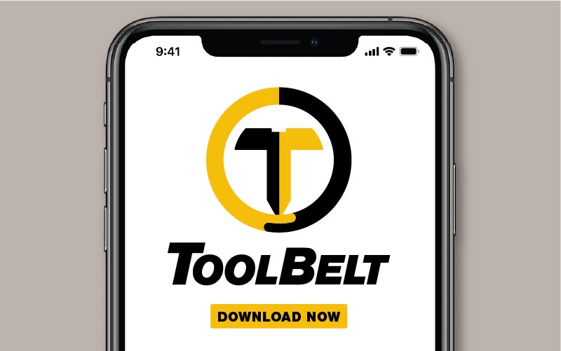
- Designed a modern, simplified logo optimized for app-icon recognition.
- Established a new color palette and visual guidelines for imagery across the app.
- Partnered with developers to validate design feasibility and ensure smooth implementation.
Project Scope
A full redesign focused on making the gardening experience more accessible and visually engaging:
Brand Identity Refresh
- Redesigned the logo for a modern, simplified look with stronger visual presence as an app icon.
- Created a mark that communicates the app’s purpose at first glance.
- Established a cohesive brand identity that reflects the organic, growth-focused essence of gardening.
- Authored brand guidelines to enforce consistency across all app touchpoints.
- Designed iconography aligned with the refreshed brand aesthetic.
Information Architecture & Content Strategy
- Restructured main categories to align with gardeners’ real-world workflows.
- Conducted user research to map how gardeners organize and access plant information.
- Streamlined navigation to reduce cognitive load and surface key features faster.
- Reprioritized the content hierarchy around the most-used gardening tools and resources.
- Created user flow diagrams to optimize the pathway from planting to harvest tracking.
Visual Design System
- Developed a color palette that evokes freshness, growth, and natural elements.
- Established an image style guide for visual consistency across the app.
- Produced high-fidelity mockups showcasing the redesigned interface across key screens.
- Designed reusable component patterns for cards, buttons, and interactive elements.
- Optimized visual design for readability in varied lighting conditions, including outdoor use.
Tools Used
- Adobe Illustrator
- Adobe Photoshop
- Figma